The majority of businesses measure the impact of their marketing efforts by producing reports that highlight the performance of their growth initiatives. Over time, every business reaches the natural conclusion that the only way to understand whether their marketing is driving results is to put some numbers behind their assumptions.
Some companies will build bare-bones reports in a spreadsheet tool, while others will develop comprehensive marketing KPI dashboards that allow the business to measure the progress they are making toward their goals. The solution you choose depends on the maturity of the company you are looking to analyze.
Businesses that are just getting started will pay minimal attention to marketing KPIs, while more established and mature companies will build out entire teams of analysts to measure marketing efforts. Regardless of where you are at right now, your goal as a marketer or analyst is to create a meaningful marketing KPI dashboard that gets shared through your organization.
But digging through your company's data and organizing all your key performance indicators (KPIs) into a neatly formatted report that everyone wants to read can take forever!
And despite our best efforts, these types of reports often wind up in the TL;DR pile in the inboxes of key decision makers.
So how do you make reporting more effective?
By building a marketing KPI dashboard.

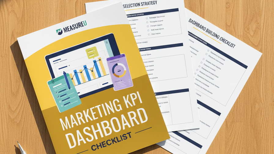
KPI dashboard Checklist
If you want to build a useful marketing dashboard, let technology do the heavy lifting. Instead of sifting through piles of data every time you need a report, have your marketing platforms do the work for you.
When you construct your dashboard to generate reports people can act on, your reports get noticed. Data-driven arguments can help authorize budgets, approve projects, and even increase salaries!
In this video and article, we're going to work through a checklist that will help you build the kind of report that gets noticed.
[thrive_2step id='12124′] [/thrive_2step]
And we’re going to learn the basics of creating an automated reporting dashboard, using two free tools (Google Analytics and Google Data Studio). Creating your KPI Dashboard in Google Data Studio will allow you to produce your report whenever you need, without data mining.
Follow along, and learn five keys to building a killer KPI dashboard to measure your marketing efforts!
Why use a dashboard to build marketing reports?
What's the difference between a dashboard and a comprehensive marketing report? The depth in which you display information to your audience. A dashboard acts as a quick-hitting benchmark of performance. With dashboards, your audience typically only pays attention to a few key highlights. A full-on report is a much more comprehensive and formal way to convey information.
Building a KPI dashboard may not replace the need to create a well laid out Powerpoint presentation for your company or clients. But it is a great way to find quick answers to your most pressing questions.
The downloadable checklist featured in this post can be used to help you build both a dashboard and marketing report presentation. How's that? Because when done right, they both operate on the same concept:
Identify the audience for your report, provide them with the information that matters most to them, and draw conclusions that allow them to take action.
How to build your marketing KPI dashboard and reports
Section 1: Understand who your reporting audience is and what information are they seeking
Step #1: Identify the team members who will receive reports or have access to your KPI dashboard
If you want your marketing reports to get noticed, then your reports need to speak your audience's language and provide your audience with data that will allow them to make decisions.
Identifying who receives your report will have a lot to do with defining which information you build into your reporting dashboard.
Write down the names and roles of the team members receiving your report, so that you can focus your reporting on their needs.
☐ My audience for this report includes:

Step #2: Know your audience's or organization's primary goal
What’s the number one performance indicator your report needs to explain? Is it profit, customer acquisition, or sales conversion rate? Identify the metric that matters most to your audience before you start building your dashboard.
Your audience’s primary goal needs to be the centerpiece of your reporting.
Identify your audience’s number one macro goal. That way, your dashboard, and reports will tell the story of your audience's journey to achieve their goal.
☐ My audience’s primary goal is to ___________

Step #3: Define your reporting objectives
Define why you are delivering your report and what you need your dashboard to accomplish before you start putting together any material. Outlining your reporting objectives will help keep your report focused on information that will allow your audience to take action.
Here are some examples of reporting objectives:
- I need to make my managers/clients aware of how our PPC marketing is performing so that they can authorize the budget we need to grow our campaigns
- My report needs to show my team the results of our content marketing efforts so that can we adjust/improve our strategy and hit our targets.
- Our purchasing department needs to see how our product categories are performing so that they can make informed buying decisions.
☐ Write out your reporting objectives before you start creating your dashboard.

Step #4: Identify the KPIs that need to be in your dashboard
Based on your audience’s primary goal and your objectives, which KPIs need to go in your report? Here are some examples:
Your sales and marketing team might need to see:
- Total sales
- Average order value
- Conversions
- Conversion rates
- Conversion rates by product or category
- Total number of engaged visitors
- Conversion rates by demographics
- Customer lifetime value
- Lead value
Your content team might need to know
- Total traffic
- Traffic by source
- Top landing pages
- Page Value
- Engagement rate per page/video
- Conversion rate by page
Your management team may want updates on:
- Month over month traffic, sales, or list growth
- Total customer engagement
- Lead conversion rate
- Total sales by product category
- Cost of customer acquisition
☐ Identify the KPIs that need to be in your report.

Pro Tip: Make sure the KPIs you choose for reporting are relevant to your audience's primary goal, and that they help support your reporting objectives.
Section 2: Locate and organize the KPIs for your report
Identify the data source for each KPI in your dashboard
If you're focused on website related marketing KPIs, you might only need to access Google Analytics. When you configure Google Analytics correctly, you can track just about any marketing data point you need, website traffic, revenue, email opt-ins, conversions, etc.
But, depending on how your organization collects their data, you may need to incorporate information from other systems, like your email marketing suite or sales management platform.
Determine where each metric you need is located, so that you know which marketing systems you need to access to build your dashboard.
☐ My organization’s KPIs can be found in the following systems:

Section 3: Choose which platform will you use to build your KPI dashboard
My current recommendation for a dashboard building tool is Google Data Studio (GDS). I've experimented with just about every major data reporting platform out there, and I've even built my own using platforms like Microsoft Excel, Microsoft Access, Microsoft SQL Server, MySQL, ASP.NET, Tableau, Cyfe, Klipfolio, and Google Charts. Based on my experience, Google Data Studio is the most flexible and user-friendly free dashboard software available. We've got a complete Google Data Studio tutorial to get started building amazing dashboards if you're unfamiliar with the platform.
You can connect GDS to many other marketing systems, including Google Analytics, Google Ads, Salesforce, and Twitter. You can also use the Supermetrics connectors to integrate Facebook and LinkedIn data with your GDS reports. If you aren't familiar with Supermetrics already, we cover it extensively in our PPC reporting guide.

Recommendation: If you don’t have a reporting tool in place, we highly recommend using Google Data Studio.
☐ Step #1: Build your KP Dashboard in Google Data Studio
To start building your KPI dashboard in Google Data Studio, follow these steps:
☐ 1. Setup a free Google Data Studio account
You can sign directly into Google Data Studio when you're logged into your Google Account.

☐ 2. Create a new report
After you've signed into Data Studio, you can select a reporting template, or create a new (blank) report.

☐ 3. Connect Google Data Studio to your Google Analytics account (or other marketing platforms)
Once you have a new report in place, you need to connect your report to a data source. You can select a data source for your dashboard by accessing your reports settings under the “File” menu.

From the settings menu on the right-hand side of your screen, you can connect to an existing data source, or create a new data source for your report.

☐ 4. Add visualizations to your dashboard
Google Data Studio allows you to add line charts, bar graphs, pie charts, tables, geo graphs scorecards, and more to your dashboard. You can select these visualizations for your report by clicking on them in the header menu, and then drawing them in your report.

☐ 5. Adjust your metrics and dimensions to display your KPIs
You can change the metrics and dimensions in any of your visualizations by clicking on that visualization and using the data menu on the right-hand side of your screen.

In the data menu, you can also adjust the data source for your visualizations.
Check out our article on building a Complete SEO Dashboard to see a full Google Data Studio tutorial.
☐ Step #2: Organize the KPIs that will go into your dashboard
A good reporting dashboard is like a picture book. It uses charts and graphics to form a narrative about how your business is performing.
Google Data Studio allows you to freely move all the visualizations in your report around your dashboard. Use GDS to organize your KPIs in a manner that will help you tell the story you need convey to your audience.
Section 4: Analysis – What does the data tell you and how will that influence your organization?
Now that your beautiful KPI dashboard is complete, its time to analyze the data. If you followed the steps in our checklist, your dashboard should include high-value information that helps your audience draw conclusions and take action.
But you always want to audit and analyze your finished product before sharing it with others.
Review the information in your reporting dashboard and ask yourself:
☐ Does this report provide valuable information to my audience?
☐ Is the information in my dashboard cohesive and easy to understand?
☐ Does my report show my audience what their efforts, or the efforts of others in the organization, are accomplishing?
☐ What’s the most logical conclusion I can draw from the data in my report?
☐ Can my audience use the information in this report, and my analysis, to take action?
☐ What action do I hope to inspire others to take based on the information in my reporting dashboard?
Section 5: Future report delivery and automation
Building an automated dashboard can save you loads time gathering, formatting and organizing your data.
But the reason we worked through the all the steps in this checklist is that when you automate to early in the process, your dashboard can turn into a mess of mismatched data. However, after you've created a working KPI dashboard, there may be opportunities to add additional automation to your reporting.
Here some automation focus areas that can help you reduce your reporting workload:
☐ Data Collection
Having a dashboard allows you to automate the data collection process. Once you get the hang of using Google Data Studio, you'll find that you can use the third-party data connectors and API calls to take your automation even further.
☐ Data cleaning/data formatting
You can use filters and segments in your Google Analytics views to help refine and clean the data you import into your dashboard. You can also use the Google Analytics API to manipulate your data before it enters your dashboard.
☐ Chart generation
After you get the right visualizations in place and save your Google Data Studio dashboard, your charts and graphs will automatically populate with data. All you have to do is adjust your date settings, and your report will be ready to go.

☐ Date Comparisons
In your Google Data Studio charts, you can also set automatic date comparisons.

☐ Sharing insights and report delivery
One of the great features of Google Data Studio is that your reports are generated based on live data. So, if you want to share your Dashboard with someone all you do is give them access, and send them a link to the report.
Unlike Google Analytics, Data Studio doesn't have an internal automated dashboard delivery setting. But you can use your email service to automate report notifications for your team, clients, or stakeholders. As long as you don't change the URL of your dashboard, your team members will be able to view and interact with your report via their Google account and the link you send out in your emails.
☐ Analysis
Fortunately, for that sake of our job security, the analysis is the most challenging part of reporting to automate. There are tools like Quill Engage that will generate basic automated analysis (like the report below) based on your Google Analytics data.

But high-level, contextual analysis is still a human job, and likely to remain that way for the foreseeable future.
Reviewing the five keys to building an effective KPI dashboard and report
That wraps up our KPI Dashboard checklist. Here's a quick review of our five keys to building a high-quality KPI dashboard:
- Understand who your reporting audience is what information they need.
- Locate and organize the KPIs for your report in a spreadsheet.
- Choose the platform where you will build your KPI dashboard.
- Do your Analysis: Determine what KPIs tell you and what that means for your organization.
- Automate your future report creation, delivery, and basic analysis to save yourself time.
[thrive_2step id='12124′] [/thrive_2step]
How are you doing with your reporting process? – Leave a comment!
This article was inspired by requests from the Jeffalytics audience. And I want to know more about how can we help you make your reporting process easier?
What's your biggest challenge? What part of your reporting process have you automated? And what would simplify or improve your reporting process? Leave a comment below, and we'll update our checklist to incorporate more solutions to the most common reporting problems.

