Size matters. This is also true for the dimensions of your visitors’ screens. Sometimes the design will break and lead to a bad user experience and lost revenue. The Google Analytics 4 browser size and screen resolution report can help you detect problematic screen sizes. One of them exists, you have to create the other one yourself. Is the effort worth it? Let’s find out…
Key takeaways
- Browser size and screen resolution are different things.
- Google Analytics 4 only collects screen resolution automatically and displays it in a pre-built tech report.
- You can collect the viewport dimensions with Google Tag Manager and then build a custom browser size report.
- Analyzing the data helps you to pinpoint potential problematic screen resolutions and browser sizes.
- Fix them, improve the user experience on your site and watch your conversions and revenue skyrocket.
- Chillax and ask for a royal bonus from your boss or customers.
What is the difference between browser size and screen resolution?
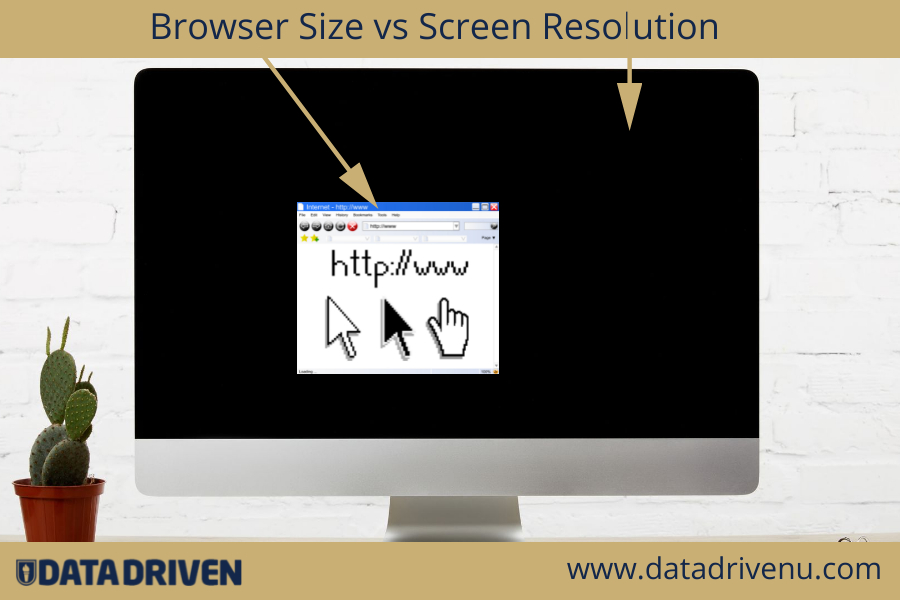
Both browser size, aka viewport size, and screen resolution use pixels as measuring units for width and height. Screen resolution refers to the hardware of your device, whereas browser size is software related.
The image below illustrates the difference between browser size and screen resolution.

For the sake of clarity, the cactus has nothing to do with what follows. Or has it?
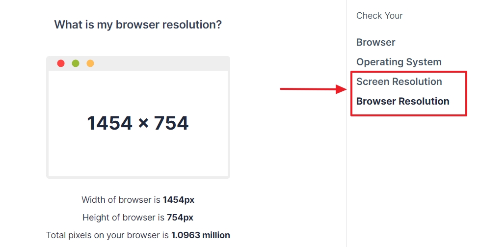
To quickly detect your screen resolution and browser size, you can visit this site.

While you are there, change the size of your browser:
- drag and resize it
- maximize the browser again

- enter and exit full-screen mode.

- show or hide a toolbar

Rinse, repeat until you fully realize that the
- width and height of your screen remain the same
- but the pixels of the height and width of your browser change.
That probably triggers the following question.

And this one too.
Why is there even a screen resolution report in GA4?
Let’s find it out.
Using the Screen Resolution Report in GA4
GA4 automatically collects the screen resolution of website visitors. The Tech Overview Report contains a dynamic card with key metrics. If you want more data, you can jump into the detailed Screen Resolution Report.
If you skipped the previous section, be aware of the following:
Knowing the size of the screens of your visitors ONLY gives you a rough idea about how they might see, and hence, experience your site
And yet, this tech report definitely deserves a place in GA4 (and your agenda).
- Everybody understands the concept of screen resolution. The fact it is available in GA4 can raise awareness about the importance of design, development, analytics and conversion rate optimization.
- For smaller sites with low traffic, even the (distorted) information can be enough to make a few tweaks with a positive impact.
So, where do you find the screen resolution data in GA4?
Let’s begin with a helicopter view of business-critical metrics: screens, users and money.
Users and revenue by screen resolution
In your GA4 property, go to Reports > Tech > Overview.

Scroll down the page to the Users by screen resolution card.

The card has two filters you cannot change: data sampling and web platform.

- Include platform = web. This refers to visitors of your website (not your app).
- An icon. If you see a warning, your card contains sampled data. The simple explanation is that GA4 is hiding some data because it could otherwise reveal private information of a user.
With the other filter, you can select 3 types of audiences and 1 monetization metric.

- Users (all)
- New users
- Returning users
- Total revenue: Purchases + Subscriptions + Ad revenue
Monetization metrics don’t appear automatically in GA4, but for now, that’s not relevant.

To see more details, click at the bottom of the card on View screen resolutions.
This will open a detailed report with the dimension you selected on the card. Don’t worry, you can change this any time.
The screen resolution detail report
You can access the Screen Resolution Report from either the Tech overview card, or under Reports > Tech > Tech details.

By default, this report uses Browser as the primary dimension.
You can change this by clicking on the arrow pointing down in the first row of the table report.

Then, click on Screen resolution.

Now, the real fun can begin.
And that’s a problem, because this report can easily eat away hours of your time.
Trust me, I experienced it while writing this article.
But then again, this is what we love doing at Data Driven U: help people like you save time.
Our GA4 Toolbox, for instance, is packed with how-to-guides, so you don’t have to figure it out on your own.
This is also why I mention some practical use cases of what you can actually do with the screen resolution data.
Historical data of visitors’ screen resolutions
At the top of the report, you can see a timeline with screen resolutions of your audience.

How is historical screen size resolution important for you?
- This data is worth keeping an eye on when a new fancy laptop or smartphone gets launched. Your site may not have been fully optimized for it.
- Did you redesign or optimize the responsiveness of your website? The timeline can reveal if you attract more or less users with a certain screen resolution. Annotations in GA4 are a great feature for these moments.
- Sudden drops can indicate that your site is (partly) broken on devices with specific screen resolutions.
Users by screen resolution graph
This card gives you a quick glance of the most popular screen resolutions of your visitors.

How in the name of Odin, Zeus and his grandmother can this graph ever be important for you?
Call me dumb, but other than triggering curiosity, I don’t see any value. The card is static and a shadow of the dynamic screen resolution card of the Overview Report.
Screen resolution data table
As in any other GA4 report, the table is interactive and filled with metrics of pre-configured dimensions that are relevant for the report.

How can the screen resolution table be important for you?
- If you are tracking transactions (purchases, ads, subscriptions) in GA4, scroll to the last column. Here you can find the Total revenue. You can see the exact amount that was generated on every single screen resolution of your visitors .
- You can sort the table in ascending/descending order and quickly find the worst performing screens. To do so, click on the arrow that shows up when you hover over Total Revenue.

- If you don’t track monetization metrics on your site, the second last column of the table reveals on which screen resolutions conversions suck. For now, let’s stick to the money and select begin_chekout as conversion. On which screen dimensions did visitors enter the checkout funnel, but not purchase from you?

The table shows a lot more about engagement rates, users and events.
This is a true goldmine if you run a huge site with many visitors.
Export the screen resolution report
Instead of scrolling through the table, you can export the data to a CSV file.
To do this, click on Share this report at the top of the page. Here you can share a link or download a CSV file.

CSV is the best choice for ecommerce because not every user of your GA4 property may have access to the revenue data.
Getting bored? There is even more to explore…
Screen resolution data and second dimension
User experience doesn’t depend on one aspect of your site. If you add a second dimension to the report, you get more insights on where things go wrong.
Let me illustrate this with an example that makes absolutely sense in the context of this article: the browser.
To add Browser as a secondary dimension, click on the + sign next to Screen resolution.

Then click on Platform / device > Browser.

And there it is: data that can help you increase your revenue.
In the screenshot below, for instance, you can see a great potential opportunity.

- Open your site with a Safari browser.
- On a screen of 1024 X 1366 pixels (No need to buy a new screen. You can use , for instance, this browser extension).
- Begin the checkout process on your site.
- Check what is going wrong. During the selected date range the funnel was entered 18 times and yet no purchase was made.
Filter to narrow down
You can also filter the report. Let’s take the previous one and add a filter for the Operating System.
At the top of the page, click Add filter.

At the right of your screen, choose Operating System as Dimension. Then select the values. E.g.: Mac, Windows…

The timeline now shows you the usage of the screen resolutions for the selected operating systems.

There is one more thing. You can also create comparisons.

This allows you to find answers to intriguing questions, such as:
- What are the screen resolutions
- + browsers
- of visitors who generated revenue
- and entered your website through the home page?
GA4 knows the answer.

Screen resolution data is like a first quick health check. If you spot suspicious symptoms, you can best involve the website experts.
Giving your developers and designers access to GA4 is not a bad idea…
I am sure they will be interested in the following part.
If you are not a techie, you can skip it. But don’t skip the final paragraph.
How to create the browser size report in GA4?
In order to see the viewport dimensions of your visitors in Google Analytics 4, you need to follow 4 steps.
- Create a variable in Google Tag Manager.
- Add it to the GA4 tag.
- Create a custom dimension in Google Analytics 4.
- Build a report.
Step 1: Create a variable in Google Tag Manager
In GTM, open Variables.

Click New.

Give a name to the variable. You can enter, for instance, “Browser size”. Always make sure that it’s clear what the variable is meant for.

Click on the gray icon to open the variable configuration.

Choose Custom Javascript.

Enter Javascript that detects the viewport and Save the variable. You can use this script. (source)
function() {

  var width = Math.max(document.documentElement.clientWidth, window.innerWidth || 0);

  var height = Math.max(document.documentElement.clientHeight, window.innerHeight || 0);

  var dimensions = width + 'x' + height;

  return dimensions;

}
Step 2: Add the JS variable to your GA4 tag
In GTM, click Tags.

Click GA4 configuration.

Click on your GA4 configuration tag.

Click Add row under User Properties

Give your property a name. You can choose, but use snakecase to not break things later on. E.g.: viewport_dimensions.

Click on the icon next to the Value field.

Choose your freshly created variable. In our case, we used “Browser size”, but you may have named it differently.

Click Save.

It’s smart to test changes in GTM before you publish them. For the sake of brevity, we assume that you are familiar with it.
Now, switch to your GA4 property.
Step 3: Create a custom definition for the viewport dimensions in GA4
In GA4, open Custom Definitions in the Admin section.

Click the Create custom dimensions button.

Fill in the fields and click Save.

- Dimension name: use a descriptive name.
- Select User as the Scope.
- Description: optional, but it’s good to write it down for future reference.
- User property: use the name you created in step 11 above. In our case: viewport_dimensions
Wait 24 hours for the custom dimension to show up in GA4.
Step 4: Create your browser size report in GA4
Open the Tech report in GA4.

Click on the Customize icon at the top of your report.

Click on Dimensions of the Report Data section.

At the bottom, click Add dimension and then select the dimension you created in step 3.

Click on the 3 dots and then on Set as default.

Click on the Apply button.

Click on the Save button and choose Save as a new report.

Give your report a proper name, such as Browser size. As a designer it is tempting to call it Viewport, but you can prevent a lot of questions from colleagues when you keep it simple.
Optionally, add a description for your report and click Save.

You can now find the report in the Library.

If you want to, you can keep it there, hidden. Alternatively, you can add it in the GA4 navigation menu.
Final note
The above information about the screen resolution and browser size report in GA4 is a lot to take in.
I am not only referring to the steps you have to do and the insights you can get from it.

There is one thing that matters even more than collecting and analyzing the details of your visitor’s screens, windows, viewports, pixels and whatnot.
Google Analytics 4 is a business tool
Unless you are a freelancer, it is also a platform that connects and supports different roles (Designers, developers, marketers, stakeholders, the CEO…) teams and departments to achieve mutual business goals.
On behalf of the Data Driven U team, I wish you all the best finding screen and browser size opportunities to improve the user experience on your site. And when you do, ask your boss for a bigger screen and a cactus to put next to it…
