Most marketing dashboards are slow because they're pulling from live APIs and blending data inside the tool. Fix that one thing and a lot of your other problems disappear.
Morgan Jones, CEO of Power My Analytics, walked our MeasureU community through that fix and a whole lot more. Power My Analytics is a company we've brought back to MeasureU and MeasureSummit year after year because we trust their work and their product delivers.
Here's the full version of Morgan's presentation on how to build dashboards that actually get used.
Watch the Full Breakdown
Morgan covers dashboard creation from scratch, walks through his real-world Greek Market e-commerce dashboard, and breaks down the exact process for going from business objectives to automated reporting. Whether you're brand new to dashboards or you've been building them for years, there's something here worth stealing.
What You'll Learn in This Post
- Why most dashboards fail before they even launch (hint: wrong KPIs)
- The process for dashboard creation: start with business objectives, identify KPIs, build small, automate
- How to structure dashboards for different audiences (executive vs. marketing team)
- The difference between KPIs and metrics, and why confusing them kills your reports
- A real-world e-commerce dashboard walkthrough with actual data
- Why data warehousing is the secret weapon most dashboard builders skip
- How to automate your reporting so data arrives before decisions need to happen
Table of Contents
- Why Build Dashboards in the First Place
- The Dashboard Creation Process
- KPIs vs. Metrics: Getting the Foundation Right
- Common Dashboard Pitfalls (And How to Avoid Them)
- Dashboard Tools: Data Studio, Spreadsheets, and BI Platforms
- Real-World Dashboard Walkthrough: Greek Market
- The Role of Data Warehousing
- How to Get Started
Why Build Dashboards in the First Place
Before you open Looker Studio or any other tool, you need to answer a basic question: what is this dashboard supposed to DO?
Not “what data should it show.” What should it DO.
Morgan breaks it into three categories:
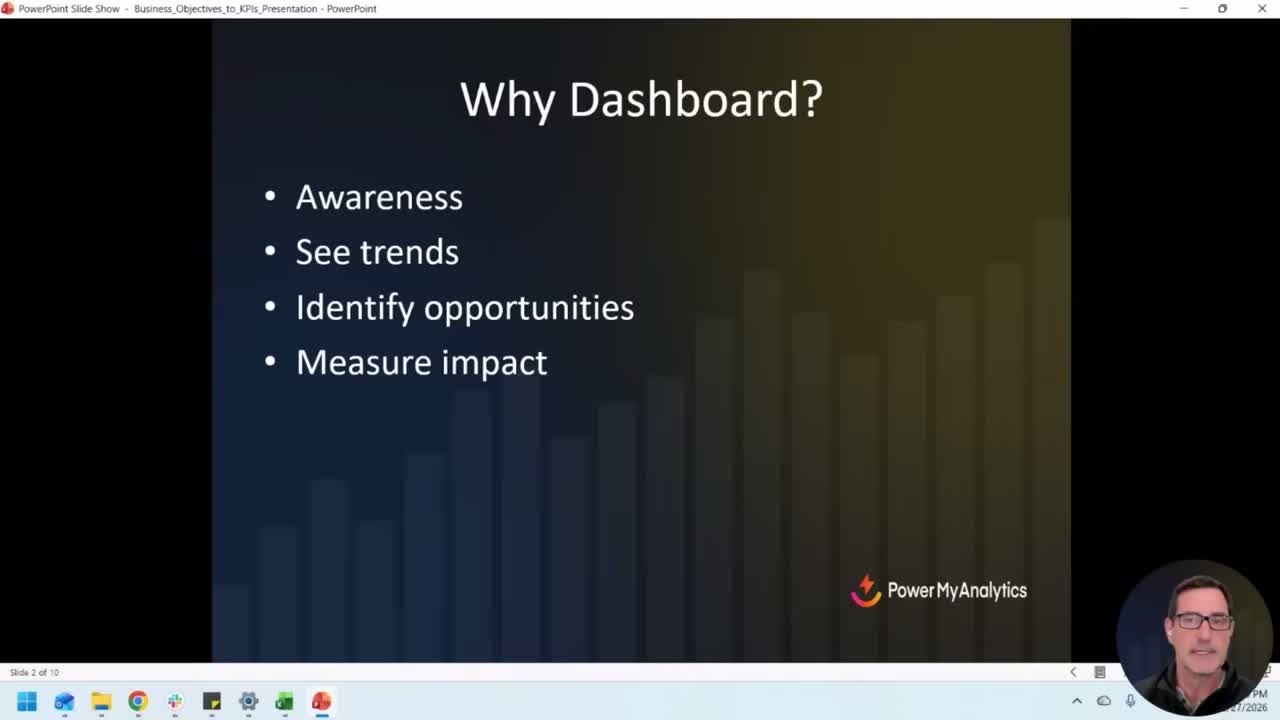
Awareness. How are you performing against your goals? Are you trending in the right direction, or are you slowly sliding without noticing? Most teams don't catch downward trends until it's too late because they're not looking at the data regularly enough.
Identify opportunities. The data is trying to tell you something. A channel that's overperforming. A product category that's quietly growing. A campaign that's burning budget with nothing to show for it. Dashboards surface those signals if they're built right.
Measure impact. You made a change. Did it work? Mark the time, watch the data, and see if things moved. This sounds obvious, but the number of teams that make changes and never measure the result is staggering.
If your dashboard isn't doing at least one of those three things, it's decoration.
The Dashboard Creation Process
Morgan's process is refreshingly simple, and I think that's what makes it actually work. Here's the sequence:
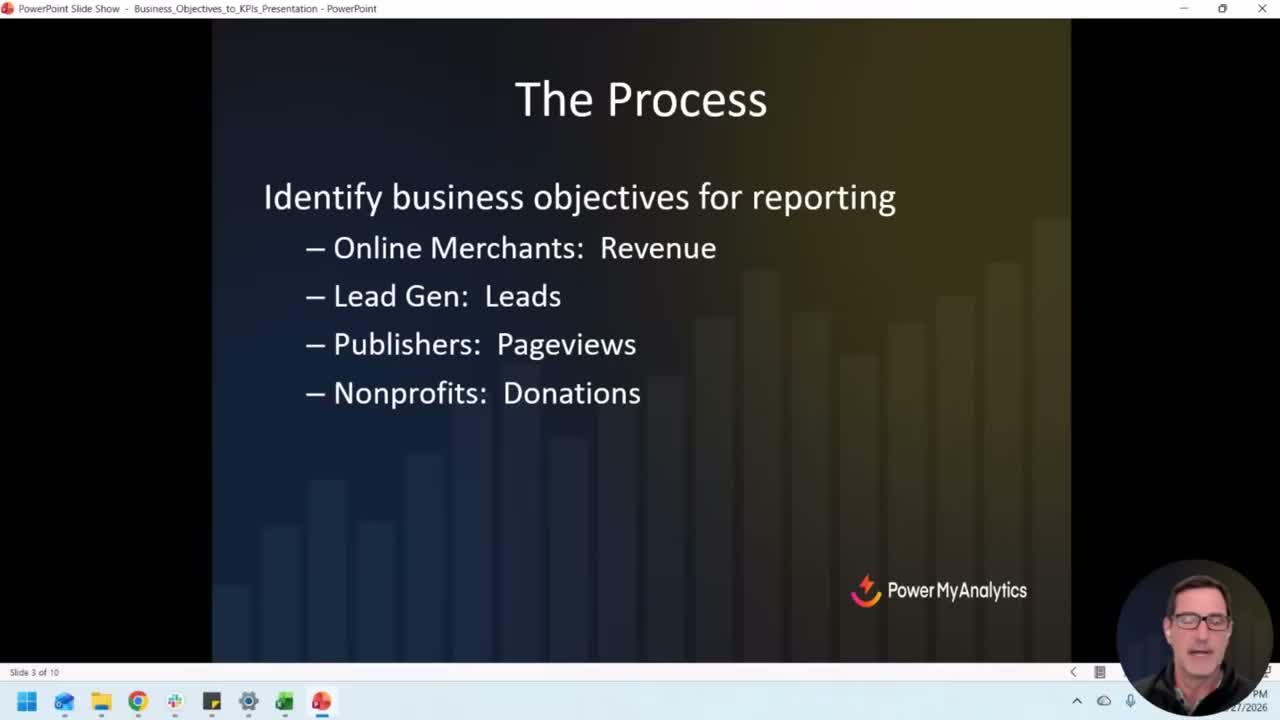
Start with business objectives. What is your company or department trying to accomplish? If you're an e-commerce business, revenue is your North Star. If you're lead gen, it's qualified leads. Publishers care about page views. Nonprofits track donations.
You'd be surprised how many people skip this step. They jump straight into building a report and pull in every metric they can find. That's how you end up with a dashboard that's 47 charts and zero clarity.
Identify your KPIs. Once you know the business objective, pick the KPIs that tell you whether you're hitting it. Two or three, max. Not twelve.
Figure out where the data lives. Google Analytics. Shopify. Your CRM. Google Ads. Meta Ads. Even a Google Sheet where someone's been manually entering sales numbers. It doesn't matter how sophisticated the source is. If the data exists somewhere, you can dashboard it.
Build something small and share it. This is Morgan's mantra and I couldn't agree more: just drop some data, make it quick, and refine from there.
Don't spend three weeks building the perfect dashboard in isolation. Get something with two or three KPIs in front of people. The questions they ask will tell you what to add next.
Make it audience-specific. An executive dashboard is not the same as a marketing team dashboard. Your CMO wants revenue and pipeline. Your paid media manager wants spend, ROAS, and conversion rates by channel. Build different views for different people.
Include trends. Year-over-year comparisons. Period-over-period comparisons. Without trends, you're looking at a snapshot with no context. A number means nothing without something to compare it to.
KPIs vs. Metrics: Getting the Foundation Right
This is where most dashboard projects go sideways before they even start.
A KPI is a strategic measurement tied directly to a business objective. Revenue. Leads. Donations. Page views for publishers.
A metric is a supporting measurement that helps explain what's driving the KPI. Add-to-cart rate. Click-through rate. Average session duration.
Here's why this matters for dashboards: if you put metrics on your executive dashboard instead of KPIs, you'll get blank stares. If you put only KPIs on your marketing team's dashboard, they won't have enough detail to take action.
For e-commerce: Revenue is the KPI. Add-to-cart, conversion rate, average order value are metrics.
For lead gen: Leads (or MQLs/SQLs) are the KPI. Ad clicks, cost per click, landing page conversion rate are metrics.
The hierarchy matters. Your dashboard should reflect it.
Common Dashboard Pitfalls (And How to Avoid Them)
Morgan identified three pitfalls that I see constantly in the wild:
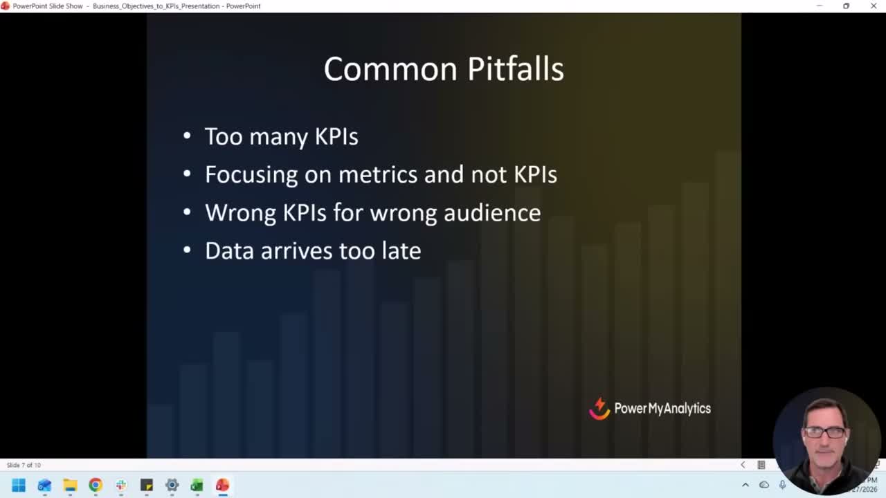
Too many KPIs on one page. We've all seen the dashboard that's basically an eye chart. Fifty scorecard widgets crammed onto a single screen. Nobody knows where to look. Nobody takes action on it. It exists to look impressive in a meeting, and it fails at even that.
Keep it simple. Especially on the first page. You can always add detail pages for people who want to drill down.
Focusing on metrics instead of KPIs. Page views and average time on page are interesting, but they're so far removed from actual business outcomes that reporting on them to leadership is a waste of everyone's time. Save those for the teams who can actually act on them.
Data arriving too late. This is the killer. If you're reviewing January's performance in March, you've already lost two months of potential course corrections.
This is where automation comes in. If your data is flowing into your dashboard daily, or even in real-time, you can catch problems while there's still time to fix them. If you're assembling reports manually once a month, you're always behind.
Dashboard Tools: Data Studio, Spreadsheets, and BI Platforms
There's no single right answer here. The best tool is the one your team will actually use.
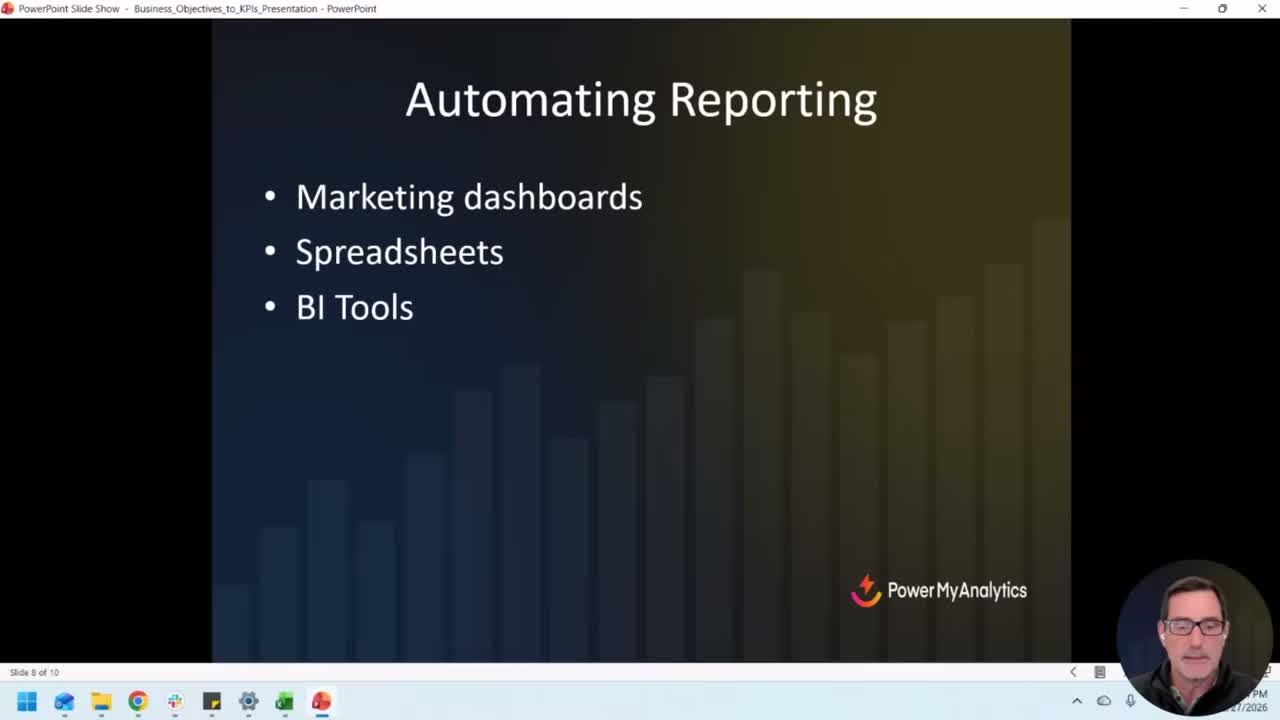
Data Studio has been around since 2016 and it's free. It's not perfect, but the price is right and it integrates well with Google's ecosystem. If you're already in GA4 and Google Ads, Data Studio is the path of least resistance.
Spreadsheets still work. Google Sheets, Excel. You can pipe data into them with connectors, format them however you want, and share them easily. Don't let anyone tell you a spreadsheet dashboard isn't “real” reporting.
BI tools like Power BI, Tableau, or Looker (the full version, not Data Studio) are for teams that need deep analysis and real-time data at scale. More powerful, more complex, more expensive.
The tool matters less than the process. A well-designed Google Sheet with the right KPIs will outperform a gorgeous Tableau dashboard that nobody looks at.
Real-World Dashboard Walkthrough: Greek Market
This is where Morgan's presentation really clicked for people.
He runs Greek Market, an import business, alongside Power My Analytics. And he was generous enough to show the actual dashboard he uses to run it, real data and all.
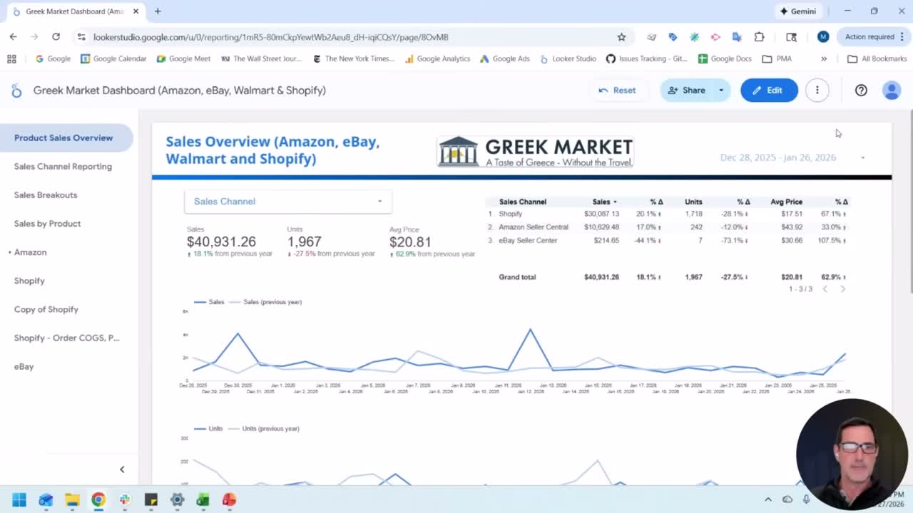
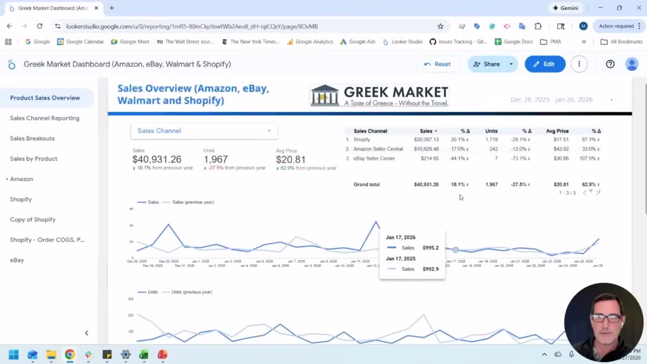
The front page is clean. Three main numbers: sales, units sold, and average price. All comparing last 30 days to the same period last year.
That's it for the top level. Three numbers. Year-over-year changes. Done.
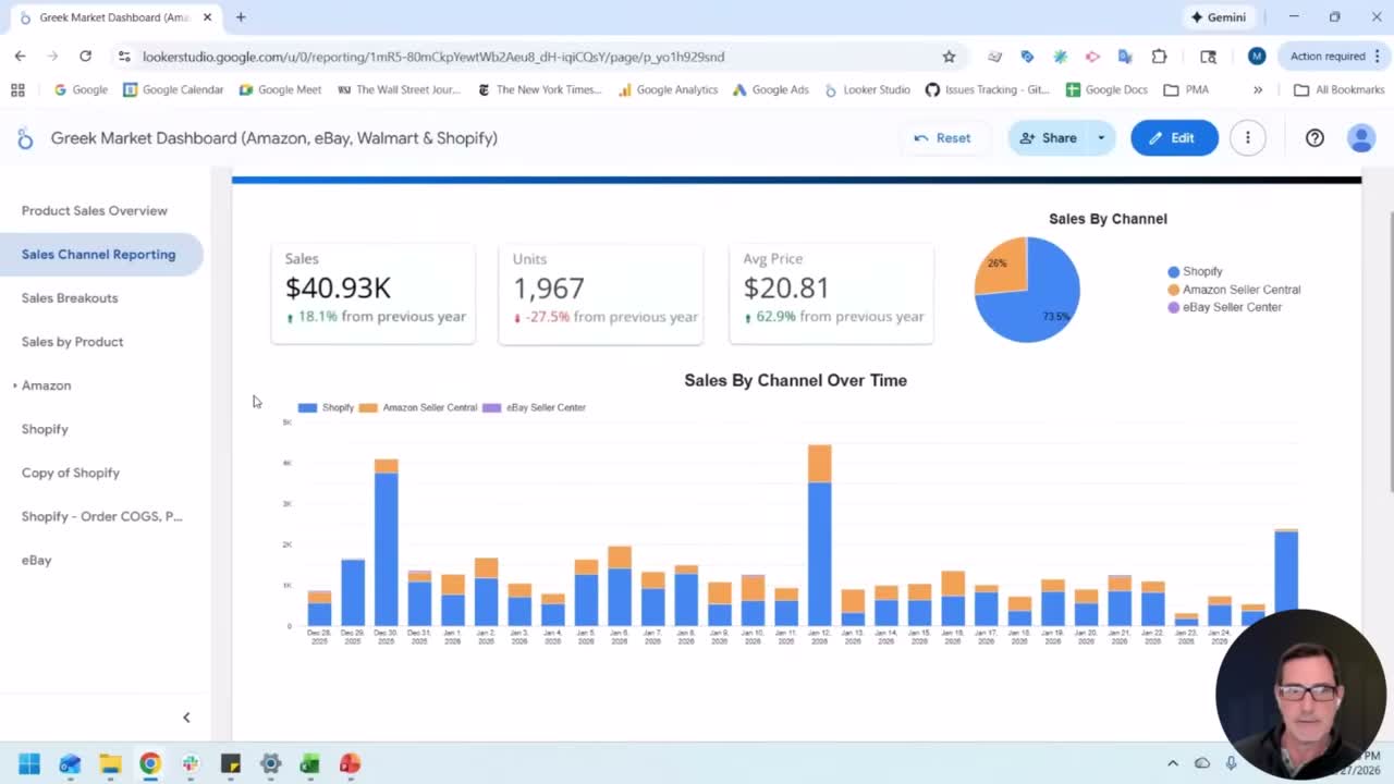
Below that, he breaks down by sales channel: Shopify, Amazon, eBay, Walmart. Each one shows the same three metrics with their year-over-year delta. So you can immediately see which channel is driving growth and which one is dragging.
Morgan explained that they made a strategic decision to raise prices, expecting units to drop but overall revenue to climb. The dashboard confirmed that exact pattern. Units down substantially, average price up substantially, total sales up.
That's a dashboard doing its job. Not just showing numbers. Confirming or denying a business hypothesis in real-time.
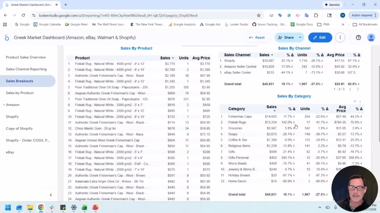
The second page goes deeper into sales channel performance with trend lines. The third page is the detail page: category-level breakdowns. Which product categories are growing? Which are declining? This is the page you use when the front page tells you something changed and you need to understand why.
Then there's a product-level page. Individual SKUs, filterable by category, channel, even fulfillment method within Amazon.
And finally, dedicated filtered views for specific products. Seasonal items like pasteli pita (New Year's bread) get their own year-over-year comparison.
The whole thing updates daily, automatically. Morgan wakes up, opens the dashboard, and knows exactly where Greek Market stands before his first cup of coffee.
The Role of Data Warehousing
This is the part most people skip, and it's the most important piece of the whole puzzle.
When you connect Data Studio directly to a live data source, like the Google Analytics API or Google Ads API, two things happen:
- The dashboard is slow because it's querying the API every time someone loads it.
- You lose historical data when the API changes or the source has retention limits.
Data warehousing fixes both problems.
A tool like Power My Analytics sits between your data sources and your dashboard. It pulls the data on a schedule, stores it in a warehouse (BigQuery, for example), and your dashboard reads from the warehouse instead of the live API.
Result: fast dashboards and a full history going back as far as you've been collecting.
Morgan made a point that stuck with me: warehousing is the secret sauce for AI insights. If you want to feed your marketing data into an AI model for analysis, you need history. You need trends. You need the data sitting somewhere structured and accessible. A live API connection doesn't give you that.
Every organization will be doing some version of AI-powered analytics soon, if they aren't already. The ones who've been warehousing their data will have a massive head start.
How to Get Started
Morgan's advice is dead simple and I agree with every word of it:
- Start with your business objectives. What is the company trying to accomplish?
- Identify your KPIs. Two or three, max. The ones that tie directly to those objectives.
- Assemble a basic dashboard. Don't overthink it. Get the KPIs up, add trends, share it with someone.
- Automate the data. Get it updating daily so you can catch problems in real-time instead of three months later.
- Refine based on questions. The best dashboards evolve. Let the questions people ask drive what you add next.
Sessions like this are what MeasureU Pro is built around. Expert training, real workflows, and a community of analysts and marketers doing this work at a high level. If you want access to presentations like Morgan's, plus courses on GA4, Data Studio, BigQuery, and more, check out MeasureU Pro.