This post is sponsored by Tracklution, a MeasureU partner.
Tired of spending hours every week building client reports in Data Studio? You're not alone.
If you're running an agency or freelancing, you know the drill. Pull data from GA4, format it nicely, add some charts, write up insights, export to PDF, send to client. Rinse and repeat for however many clients you have. And by the time you're done with one batch, it's already time to start the next.
Here's the thing: I've been playing around with something over the last few months that's completely changed how I think about client reporting. It uses server side tracking data combined with Claude to generate comprehensive reports with a single prompt.
That's where Tracklution comes in. They're a server side tracking platform that you can set up without GTM, which is especially useful if you don't have someone on your team who can wrangle Google Tag Manager. But what I didn't expect? The same MCP server I use for setup also does reporting and it does it really, really well.
In this tutorial, I'm going to show you exactly how to use Tracklution's MCP server to create client-facing reports, everything from e-commerce funnels to channel attribution to time-of-day analysis.
Watch the Full Breakdown
Check out the complete video walkthrough where I build these reports live:
What You'll Learn in This Post
- Tracklution's MCP server handles both setup AND reporting (you don't need separate tools)
- You can generate conversion funnel, attribution, and time-of-day reports with simple prompts
- The platform collects its own attribution data independent of GA4's modeling
- One agency owner manages 23 clients using this same workflow
Table of Contents
- What is Tracklution's Server Side Tracking Platform?
- Getting Connected (It's Almost Too Easy)
- Building a Conversion Funnel Report
- Creating Channel Attribution Reports for Clients
- Time-of-Day and Device Analysis
- The Weekly Report Automation Workflow
- Scaling This to Multiple Clients
What is Tracklution's Server Side Tracking Platform?
Before we get into the reporting side, quick context on what makes this tracking platform different.
Tracklution handles server side tracking without requiring Google Tag Manager expertise. You can:
- Send data to GA4 (like you'd expect)
- Collect the same data directly in Tracklution
- Track first-click AND last-click attribution
- Report on time-of-day patterns
The part that surprised me? You're not totally dependent on GA4's modeling for attribution. Tracklution collects its own source data. So when GA4 decides to attribute something weirdly based on previous sessions, you've got an alternative source of truth.
Getting Connected (It's Almost Too Easy)
I'm not going to walk through the full connection process here. I recorded a separate video on that. But I have to say, the setup is almost suspiciously simple.
You literally:
- Add a URL to your MCP connectors
- Authentication pops up
- You're done
That's it. No wrestling with configurations, no debugging connection strings. I was honestly expecting more friction.
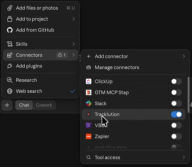
Once connected, you can check which containers you have access to with a simple prompt: “What containers can you see in my Tracklution account?”
I specifically connected just one container for this demo, but you can absolutely connect multiple and it'll list them all out.
Building a Conversion Funnel Report
Alright, let's get into the actual reporting. First up: the e-commerce funnel.
Here's the prompt I use:
“Using Tracklution data, build me an e-commerce funnel for [container name] for the last 14 days. Today is [current date].”
Quick tip: I've noticed that if I don't give Claude the exact date, it sometimes gets confused. Just add it at the end.
This takes a few minutes to run, which is totally fine. Go grab coffee. Come back.
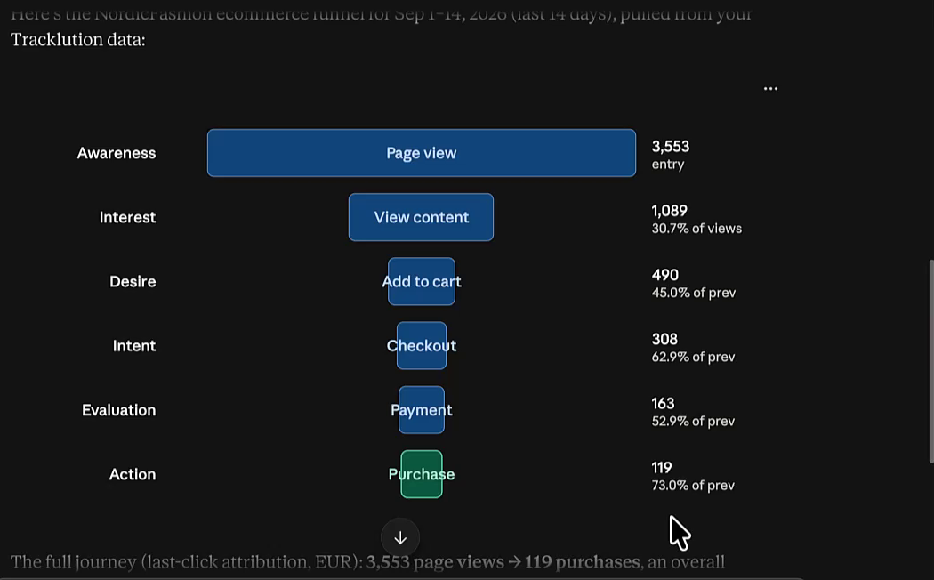
What you get back is a full funnel breakdown:
- Page views at the top
- View content
- Add to cart
- Add payment info
- Purchases
For the container I was testing, it pulled 119 purchases, about $32,000 in revenue, and roughly 3,500 page views over 14 days. When I compared these to the actual Tracklution dashboard? Nearly identical. There's always going to be minor differences between API and UI, but nothing material.
What to Watch For
The AI actually gives you analysis too. It called out that my mid-funnel was healthy but checkout was the weak point. And here's one caveat to remember: events like page views and add to cart can fire multiple times per session. So treat those upper-funnel numbers as directional, not absolute.
But this is great for tracking trends week over week. You want to see if that checkout drop-off is getting worse or better.
Creating Channel Attribution Reports for Clients
Now this is the part I personally find most valuable for clients. They don't always care about funnels. What they really want to know is how their channels are performing.
Here's that prompt:
“For the last 14 days, show me channel-level attribution including orders, revenue, and average order value. Today is [current date].”
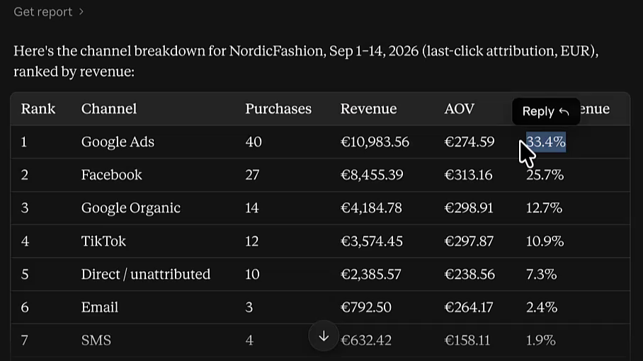
And boom, you get a breakdown that shows exactly which sources are driving revenue.
For my test container:
- Google Ads: 40 orders (33% of total purchases)
- Meta/Facebook: Fewer orders but higher average order value
- TikTok: Small volume but surprisingly high conversion rate
- SMS: Modest but consistent
Here's what hit me when I looked at this data. Google Ads is clearly my volume driver. But Facebook has a stronger AOV, almost $20 higher per order. So the measurement marketer in me starts thinking: what if I could scale Facebook? If that higher AOV holds as volume increases, that's a more profitable channel.
This is the kind of report that used to take hours to pull together. You'd be bouncing between GA4, maybe Data Studio, probably a spreadsheet. Now it's one prompt.
Time-of-Day and Device Analysis
A lot of clients, especially heading into the holiday season, need time-of-day insights for their ad scheduling. Tracklution has this data readily available.
Prompt:
“Show me the time-of-day purchase distribution for the last 14 days. Today is [current date].”
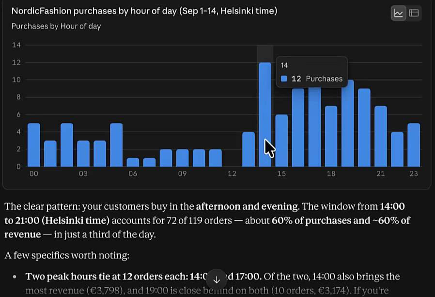
What I found was interesting. There were two clear peaks:
- 14:00 (around 12 orders)
- 17:00 (also around 12 orders)
Mornings? Dead. Noon specifically was terrible for some reason.
The AI even added caveats, like noting that with 119 orders across 24 hours, you're looking at roughly 5 orders per hour on average, so take the patterns directionally.
But here's a real example of why this matters. I had a client years ago who sold online event tickets. We discovered through time-of-day analysis that advertising Tuesday through Thursday was basically throwing money away. But Friday through Sunday? Those were her money days. We shifted the budget accordingly and she tripled her sales. Not kidding.
Device Breakdown
You can also pull device-level data. Desktop converted higher in my test, but mobile wasn't far behind, only about 10% lower conversion rate.
The recommendation the AI gave? Test mobile-specific bundles and upsells. And honestly, this reminded me of something embarrassing. A few months ago at MeasureU, we were running ads and only tested the funnel in Chrome on desktop. Turns out we had way more mobile traffic than expected, and the mobile experience was… not great. These reports catch that.
The Weekly Report Automation Workflow
Okay, so running individual prompts is useful for analysis. But what clients actually want is a consistent weekly report they can review. Something they can trust will look the same every time.
Here's the prompt I use for that:
“Build my weekly {{CONTAINER NAME}} optimization brief.
Last 14 days ending today, plus the prior 14 days for comparison. Last-click, EUR, Europe/Helsinki. Base all figures on Purchase events.
One self-contained, downloadable HTML report, 5 sections, each with a “do this”:
- Snapshot: purchases, revenue, AOV, conversion rate (Purchases ÷ PageViews), each vs prior 14 days. Add an “ⓘ” note that conversion rate is a trend measure since PageView fires multiple times per visitor.
- Funnel: PageView → ViewContent → AddToCart → InitiateCheckout → AddPaymentInfo → Purchase. Mark ViewContent + AddToCart “directional”; flag the weakest lower-funnel step.
- Channels: sources ranked by revenue, with orders, AOV, conversion rate.
- Timing: purchases by hour and by day of week; call out peak + dead hours.
- Device & browser: desktop vs mobile (conversion, AOV, checkout completion) plus browser breakdown.
Phrasing rule for rates: State every rate in one direction only: “only X% [do the thing]”. Never mix the pass-through and drop-off in the same sentence (e.g. don't write “52.9% reach payment, so 47% don't”). Default to the pass-through direction (share who advance / complete) so the number in the prose always matches a number in the chart, and let a low value speak for itself. Never make the reader subtract from 100 to understand a finding.
No caveats paragraph. Save the file to download.”
This one takes a few minutes to run. Let it do its thing.
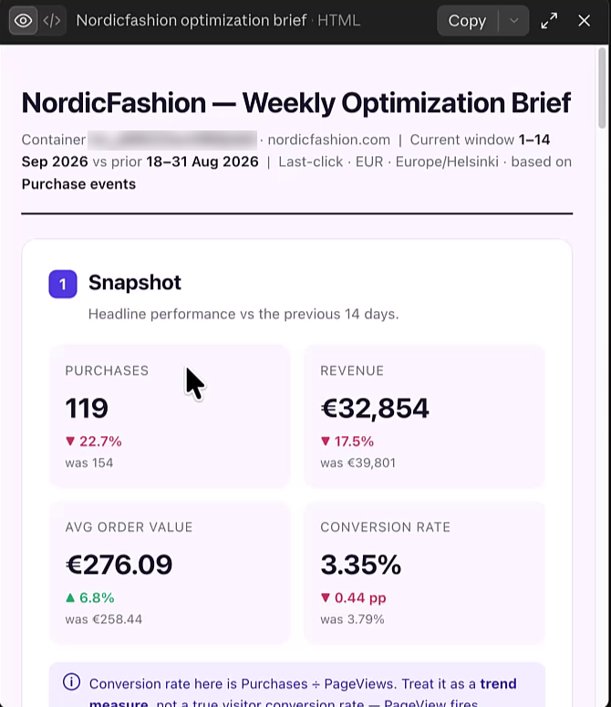
What you get is beautiful. Seriously.
The report includes:
- Executive snapshot: Orders, revenue, AOV, and conversion rate with period-over-period comparison
- Funnel visualization: With percentages and specific callouts about where drop-off is happening
- Channel attribution table: Ranked by orders with conversion rates
- Time-of-day and day-of-week charts
- Device breakdown: With conversion rate comparisons
- Actionable recommendations: The AI actually suggests what to do based on the data
One thing I appreciated: it treats conversion rate carefully. It explains that the calculation uses page views in the denominator, and since page views can fire multiple times per visit, you should treat it as a trend metric, not an absolute number.
The Workflow
- Run the prompt
- Download the HTML artifact
- Open in browser and print to PDF (or just send the HTML)
- Validate the numbers look right
- Send to client
That's it. What used to take hours in Data Studio now takes minutes.
Scaling This to Multiple Clients
Here's where it gets really interesting for agency owners.
We were on a webinar with Tracklution a few weeks back, and there was someone who has 23 clients on the platform. Twenty-three!
Can you imagine the old workflow for that? You'd need a dedicated reporting person, or you'd be spending your entire Monday morning building 23 reports.
With this setup:
- Connect all client containers to your MCP server
- Save the weekly report prompt as a skill in Claude
- Run it for each client (just swap the container name)
- Download, validate, send
You could turn this into a productized service. Weekly performance reports for all your clients, generated in a fraction of the time, using data that's more reliable than GA4's modeling because it's coming directly from the server side tracking.
Getting Started
If you're an agency owner or freelancer setting up server side tracking for clients, the Tracklution MCP server does double duty. Use it for setup (I covered that in a previous video), then use the exact same connection for reporting.
The numbers really do match what you see in the Tracklution dashboard. I validated them multiple times throughout building these examples, and the differences were negligible, just typical API vs. UI rounding.
Your next steps:
- If you're not on Tracklution yet, check out their platform
- Connect the MCP server (their help docs walk you through it in about 2 minutes)
- Start with the simple funnel prompt to get comfortable
- Graduate to the full weekly report prompt
- Consider turning it into a repeatable skill for your client roster
Ready to Automate Your Client Reporting?
This is one of those rare times where the technology actually delivers on the promise. Hours of manual reporting work, collapsed into a few minutes and a single prompt.
If you're in MeasureU Pro and have questions about getting this set up, drop them in the community. And if you give this a try, I'd love to hear how it goes, especially if you find ways to customize the prompts for your specific client needs.
Good luck with your reporting automation!